About Welovetour
Welovetour is a travel platform that specializes in selling island
trips. Its travel products include Maldive, Koh Samui, etc. It
provides users with rich and interesting itineraries and solves
various difficulties when traveling with professional services.
At
the time of the lifting of the travel ban in Taiwan, I joined
Welovetour travel agency as a web designer to help reorganize a
website that had not been updated for 3 years.
Overview
Crafting an experience that is intuitive, beautiful, and engaging to create a desire to travel to Maldives in the aftermath of the epidemic
The Maldives page is a destination page on a travel agency's website for travelers who can afford to pay medium to high prices per unit. The request was to redesign the Maldives page with the aim of enhancing brand awareness and attention, mainly by presenting professional services and travel products to increase brand trust and conversion rate.
Problem Space
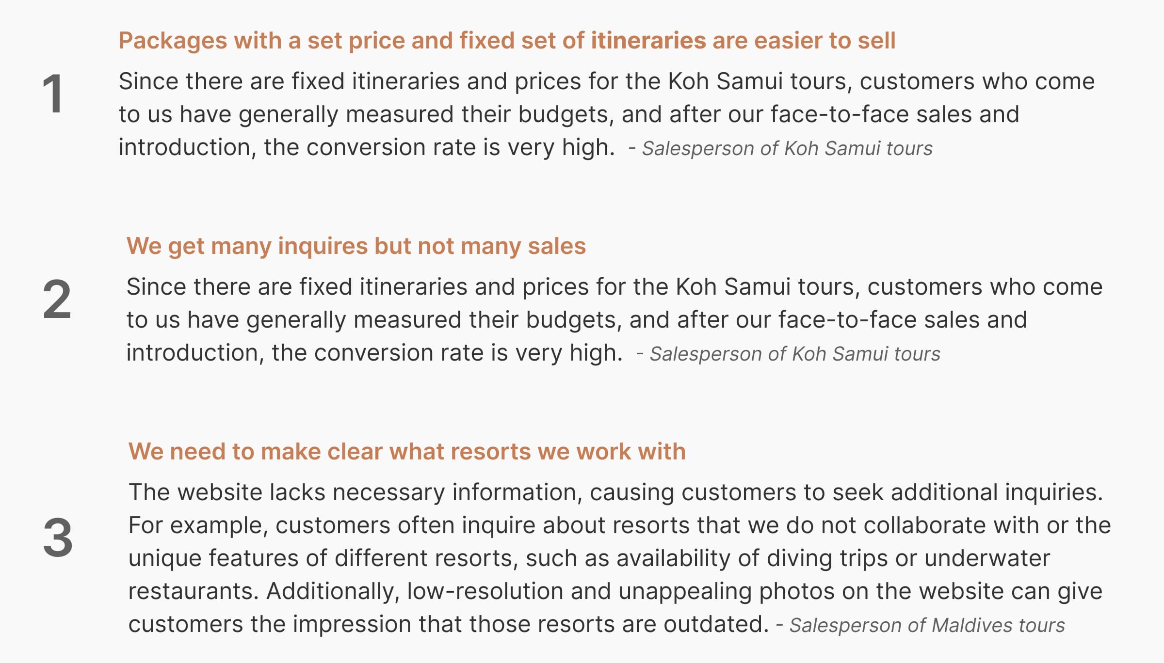
Welovetour is a trusted brand in the Maldives market, and after the epidemic, many customers who are interested in the Maldives have come to ask for itineraries. The problem is that although the Maldives is the highest unit price in the products, according to the company's data, 60% of customers ask for itineraries to the Maldives, and the conversion rate is not high. I also found that, unlike other islands that have fixed itineraries and prices listed on the website, the Maldives is more of a customized trip and requires a quote from a salesperson, which is more costly in terms of time spent by the salesperson than other products, but not many people actually buy the trip.

The Current Experience
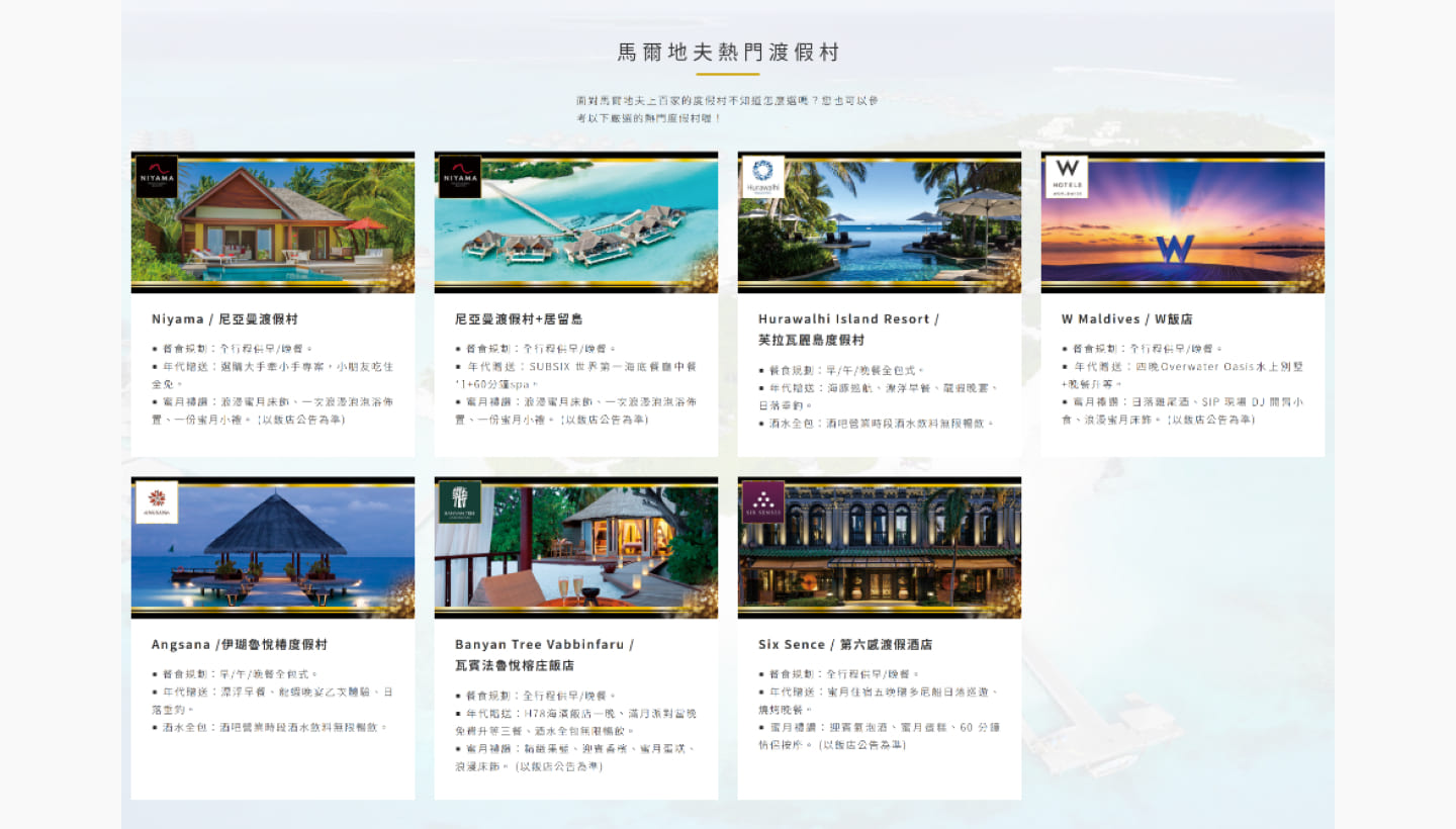
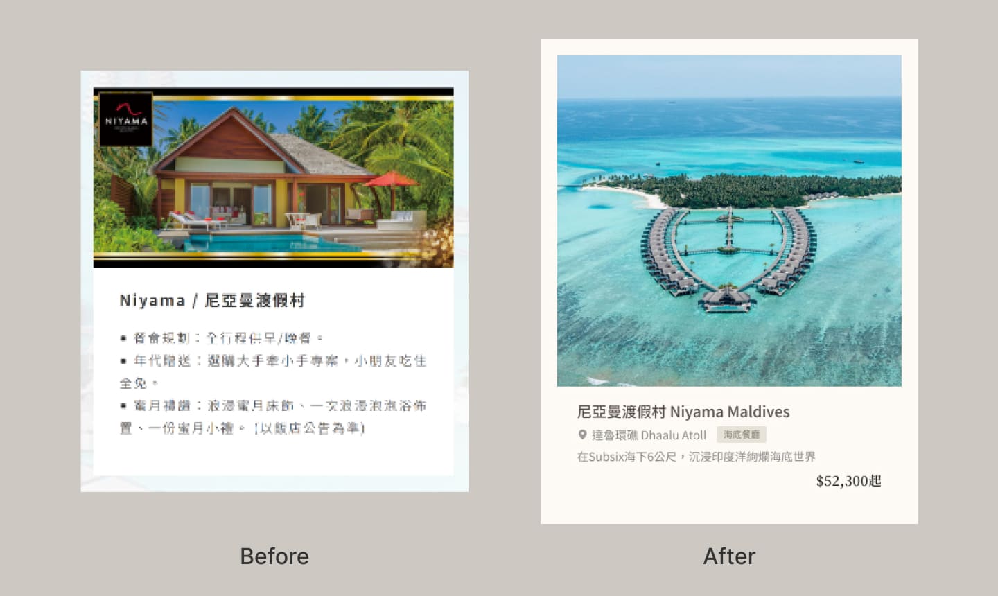
1 - outdated information and without pricing about resorts
The tourism industry has been shut down for three years because of the epidemic, and now the offerings have changed a lot, also there is no displaying pricing on site, so the users can’t get the information they want.
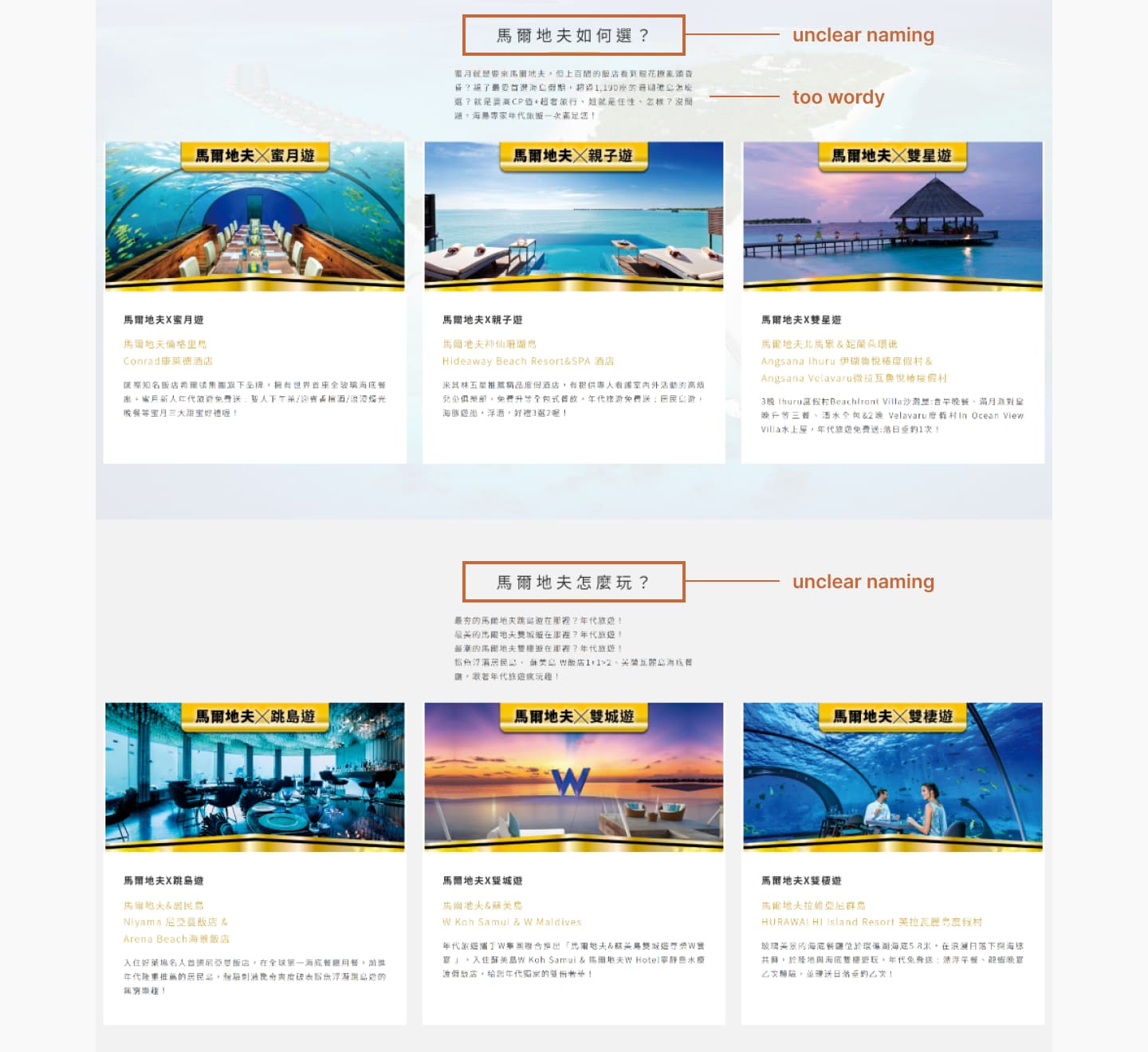
2 - Too wordy & UX writing does not match users’ expectations
The description is very long and wordy. There is too much
cognitive load on the user and they will shift away from focus
easily.
Here have two main blocks about packages:
the naming of "馬爾地夫如何選?", "馬爾地夫如何玩?" are not
clear enough to present meaning and can be confusing for the
user to understand.
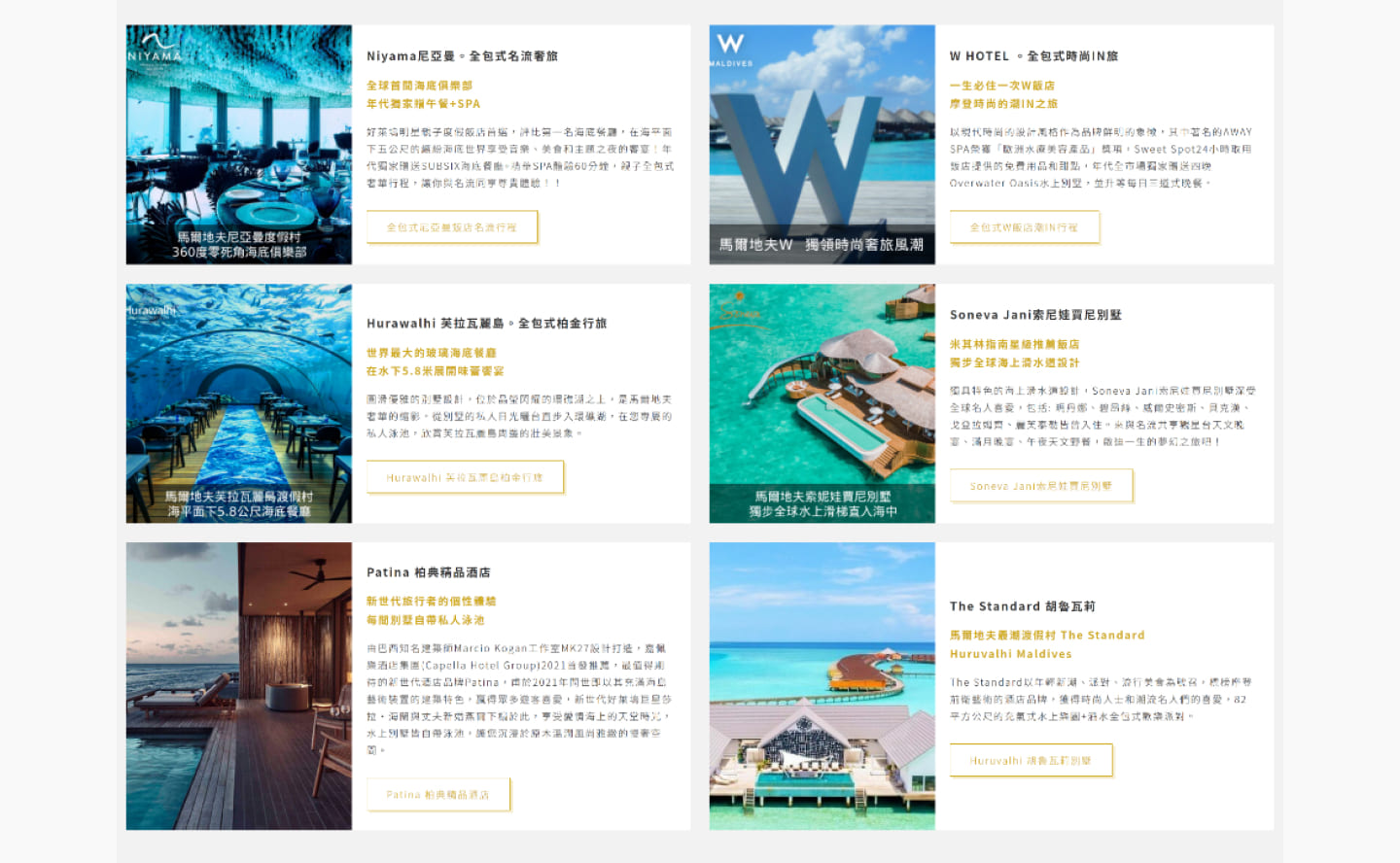
3 - Not attractive to those who want to travel to the Maldives
Visually it looks like there is no quality, and it seems that this tourist place is cheap, but in fact the price is not low, and the features of the resort are not obvious.
User Research
I interviewed four salesperson in our office. I inquired about the challenges they face attracting customers to buy our product. This included how they present travel products to their customers and what most of their customers need. I was curious about what questions customers ask their salesperson and what the focus of their sales pitch is.
Key takeaways
Potential User
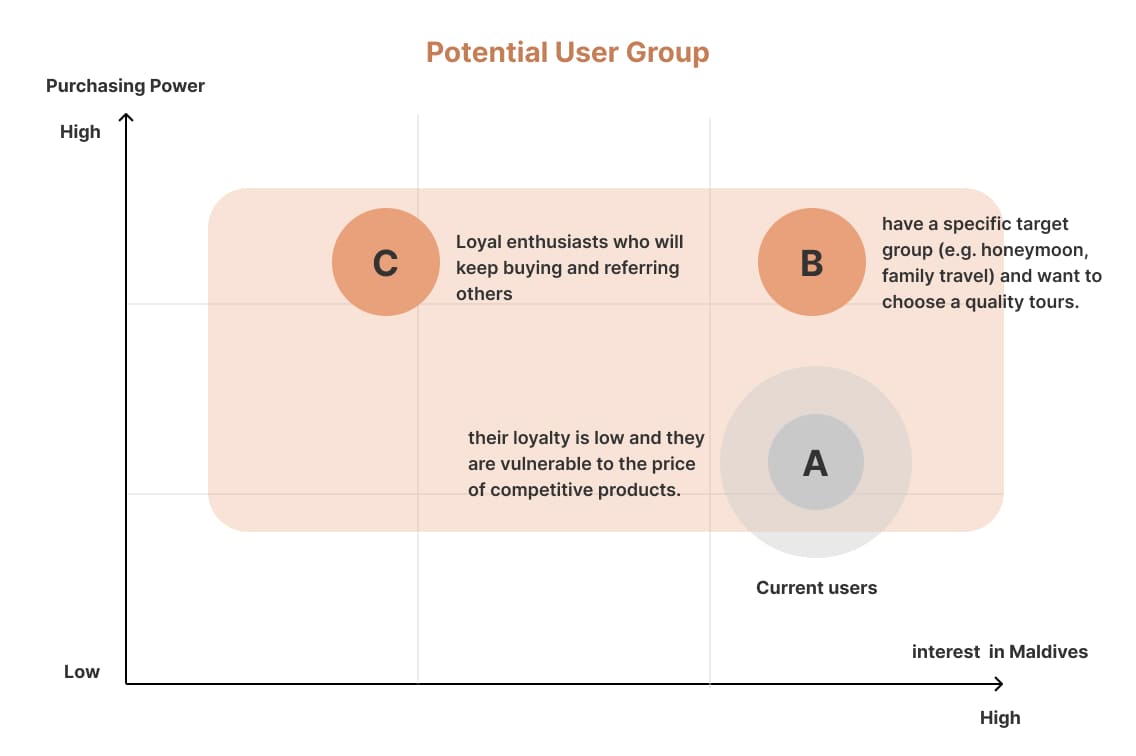
We selected group B.C as target users because they have medium or
higher purchasing power and a strong interest in Maldives.
I divided the user target group more specifically with their
characteristics. Most current users(A) are hesitant about our
itinerary because of its relatively high price, so they ended up
choosing other cheaper offerings.
It means that their loyalty is low and they are vulnerable to the
price of competitive products.
Moreover, salespeople are spending their time serving those
who will mostly not buy trips with us. In order to increase the
conversion rate, we need to attract the B.C group of users.
Competitive Analysis
We conducted a competitive analysis to find out how the travel agency
compares with its competitors.
Through my research, I found
out the pros of the competitors in multiple ways :
• The resort
options are much more then ours
• Classify resorts by theme for
user
• Lots of eye catching photos Simple, clean UI
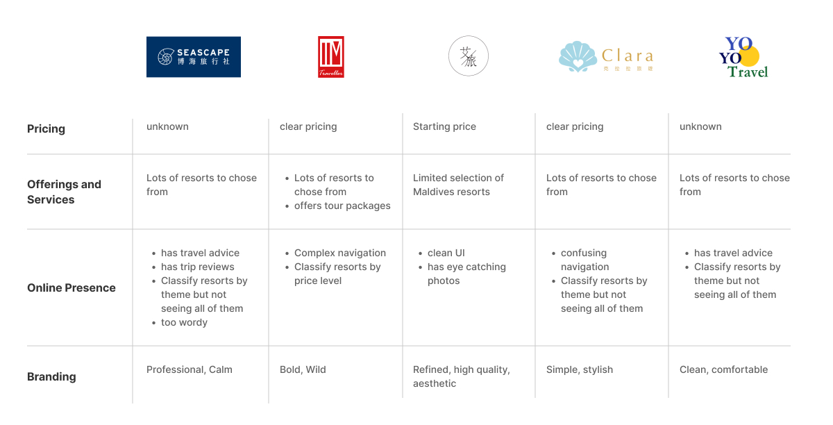
How might we generate interest in travel and attract high-quality customers to increase the conversion rate of Maldives itineraries?
Providing transparent prices and attracting customers with similar values
For the benefit of user, providing pricing not only assess if it is
within their budget or not but is also a simple and easy online
experience.
From a business perspective, providing transparent prices demonstrates
our honesty and nothing to hide and we could get rid of leads who
can’t afford our products, allowing the sales team to focus on the
customers we want to attract.
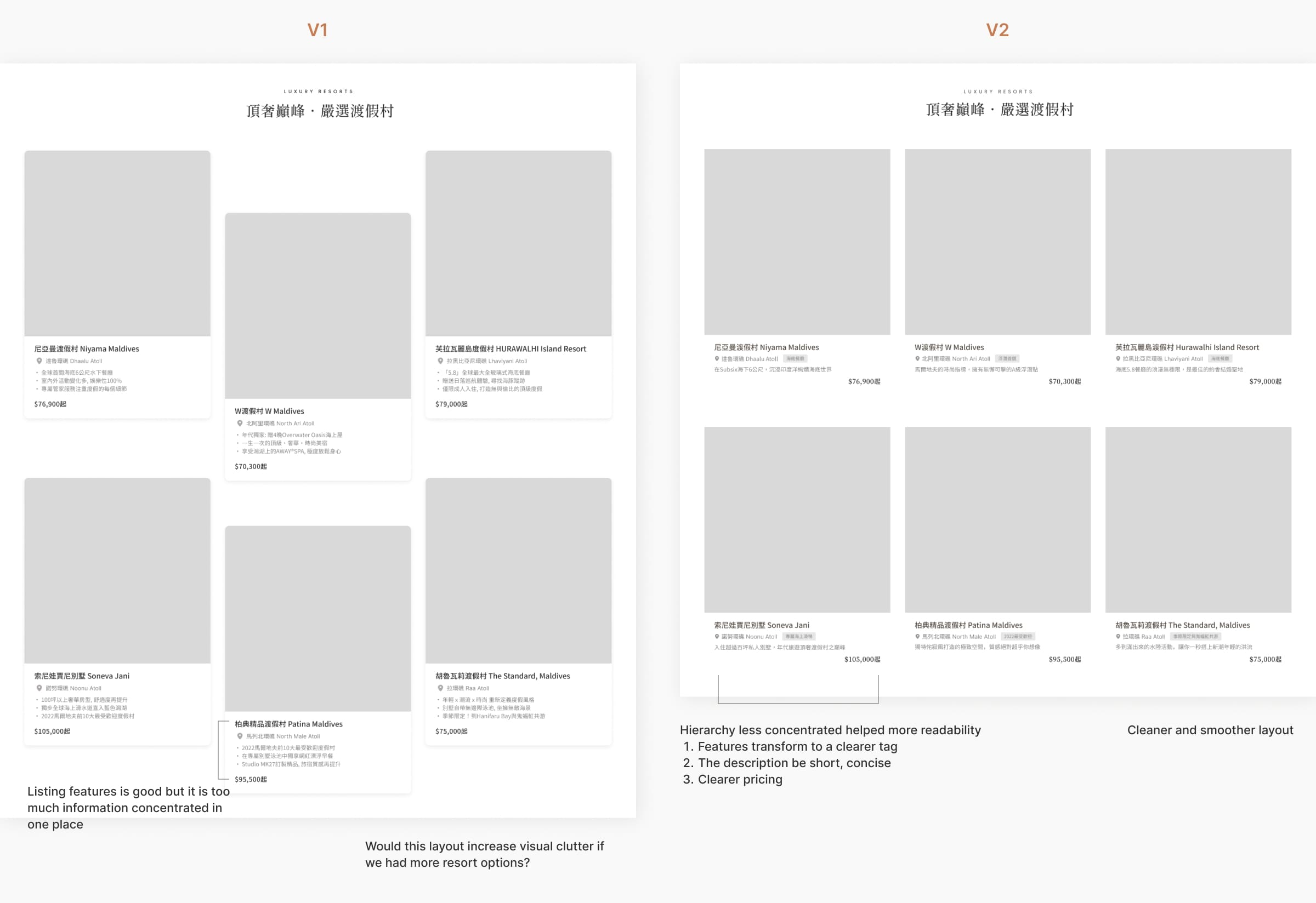
Iterations: Cards of resorts
Generating interest in Maldives and helping users find their ideal resorts
I identified 2 opportunity areas here through research.
1 - There's confusion in the myriad of resorts - users don't know
which is the best one for them.
2 - Tour packages are better for
users to understand and easier for salespeople to sell products.
Offering special tour packages
Recommend our special package tours, so that users can directly see the example trips. Giving the user options directly to reduce their time to make decisions.
Highlighting Features
the description of the resort is shorter and concise and tag the feature shows why here is popular.
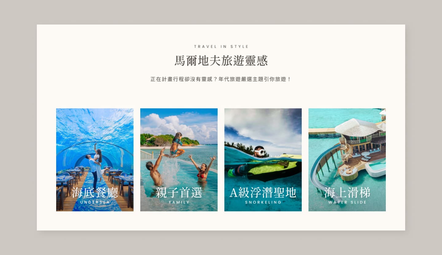
Travel Inspirations
Recommending the right resort for a specific theme might be more appealing and resonate with relevant travelers.
Expressing our thoughts on an overall vibe to users
Inspirations
Upon deciding on the target audiences that my visual design is communicating , I started brainstormed keys words of "Quality," "Warm," and "Sensual" could be portrayed with other elements on different contexts.
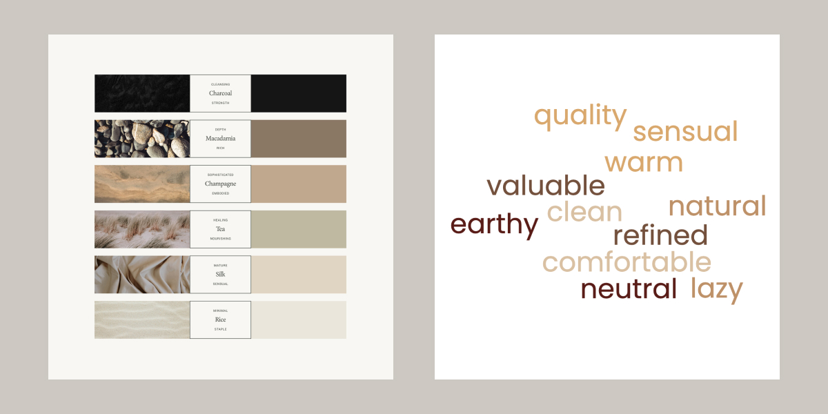
Enhancing UI to convey high-quality and warm feelings to users
The current experience was overpowered by blue and an excess of borders and elements. To make it more visually calming and inviting, I collaborated with the copywriter and evaluated which images would be visually engaging, also I used a solid background to make them stand out more.
Result
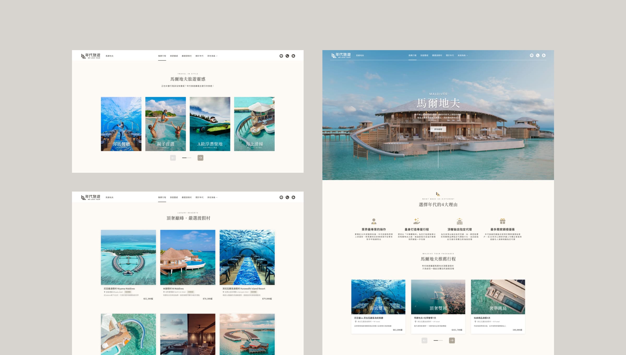
After many rounds of reviews and iterations, we came up with a page designed with a sense of clarity and purpose and is responsive across desktop, tablet, and mobile.
Tablet View


Scroll it !
Mobile View

Scroll it !

